

How To Use LED Light Colors For Different Moods?
How To Use LED Light Colors For Different Moods?
The Science of Light and Emotion
Before diving into specific colors, it’s essential to understand the "why." Light affects us through two primary pathways: our visual perception and our circadian rhythms.
Our brains associate different colors and tones with various emotions and environments—a concept known as color psychology. Warm, fiery hues might evoke feelings of comfort or passion, while cool blues can feel calming or detached. Furthermore, light impacts our biological clock. Blue-wavelength light, abundant in daylight, suppresses melatonin production, keeping us alert. Warmer, amber tones signal our bodies to wind down for sleep. Modern LEDs let us harness both these psychological and biological effects intentionally.
A Guide to LED Color Temperatures
-
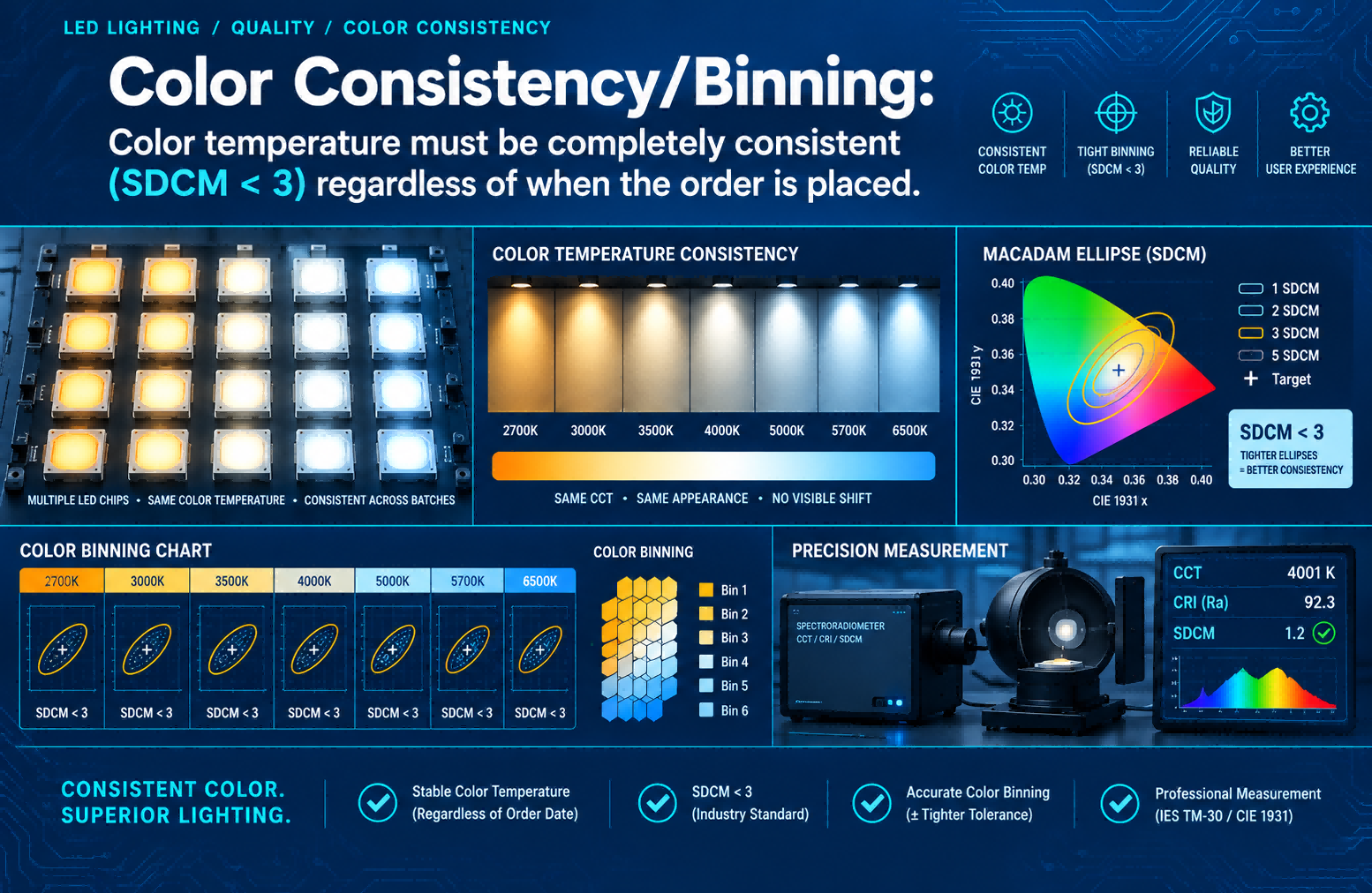
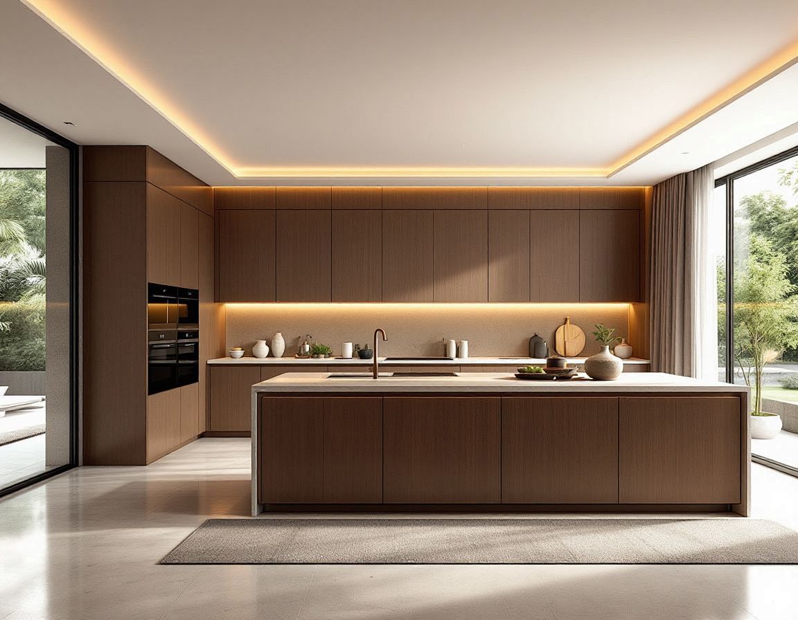
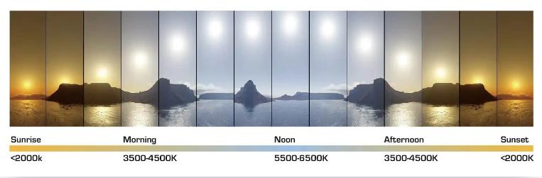
Warm White (2700K - 3000K): This light has a yellow-orange hue, mimicking sunset or traditional incandescent bulbs. It’s inherently cozy, intimate, and relaxing.
-
Neutral/Cool White (3500K - 4100K): This is a clearer, whiter light, often compared to morning daylight. It feels clean, balanced, and focused, minimizing distortion of colors.
-
Daylight (5000K - 6500K): Rich in blue wavelengths, this light resembles a bright midday sun. It is energizing, stark, and highly alerting, ideal for concentration.
Crafting Moods with LED Light Colors
-
For Relaxation and Unwinding
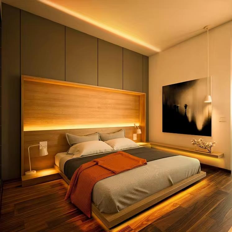
Recommended Colors: Warm white (2700K-3000K), soft amber, pale lavender, or muted pastel blues.
Best Rooms: Bedrooms, living rooms, bathrooms.
How to Implement: Use dimmable warm white LEDs in bedside lamps and overhead fixtures. Dimmability is key—gradually lower the intensity as evening progresses. In the living room, accent strips behind the TV or under shelves in a warm glow can reduce eye strain. Consider smart bulbs that can schedule a gradual shift to sunset-like tones in the hour before bedtime. Avoid any cool white or blue light in these spaces during evening hours.
-
For Focus and Productivity


-
For Energy and Social Vibrancy
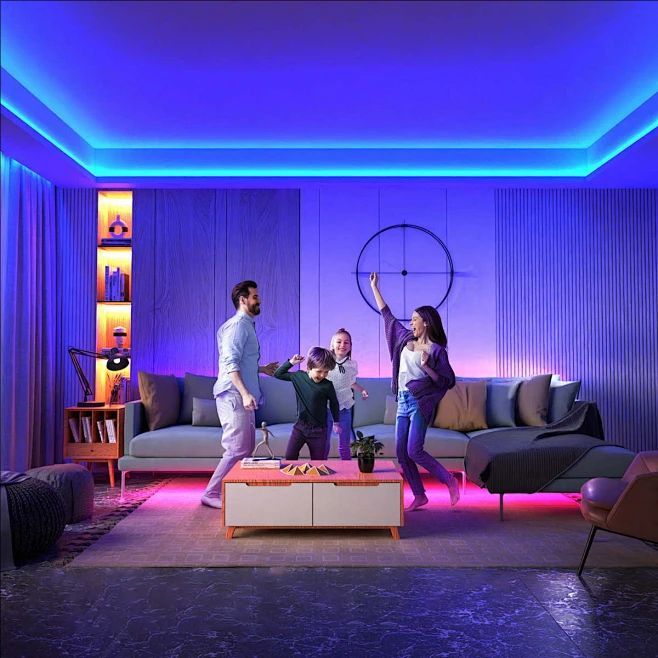
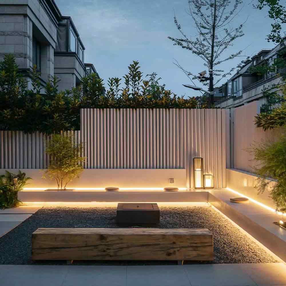
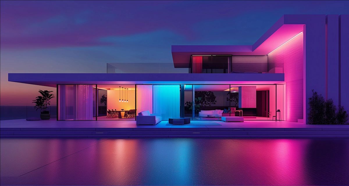
Recommended Colors: Vibrant colors like magenta, cyan, bright green, or dynamic color-changing sequences. A bright, warm white (3000K-3500K) is also excellent for social kitchens and dining areas as it makes food and people look appealing.
Best Rooms: Dining room, living room, kitchen, patio.
How to Implement: Smart RGB light strips are perfect for this. Place them along entertainment units, under bars, or around ceiling coves. Use an app to set animated themes or choose a single vibrant color as a backdrop. For a more sophisticated vibe, use dimmable warm white pendants over the dining table at a medium brightness to encourage conversation and connection.